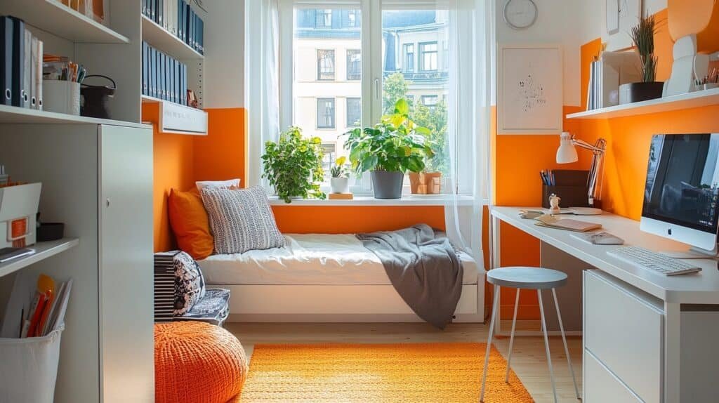
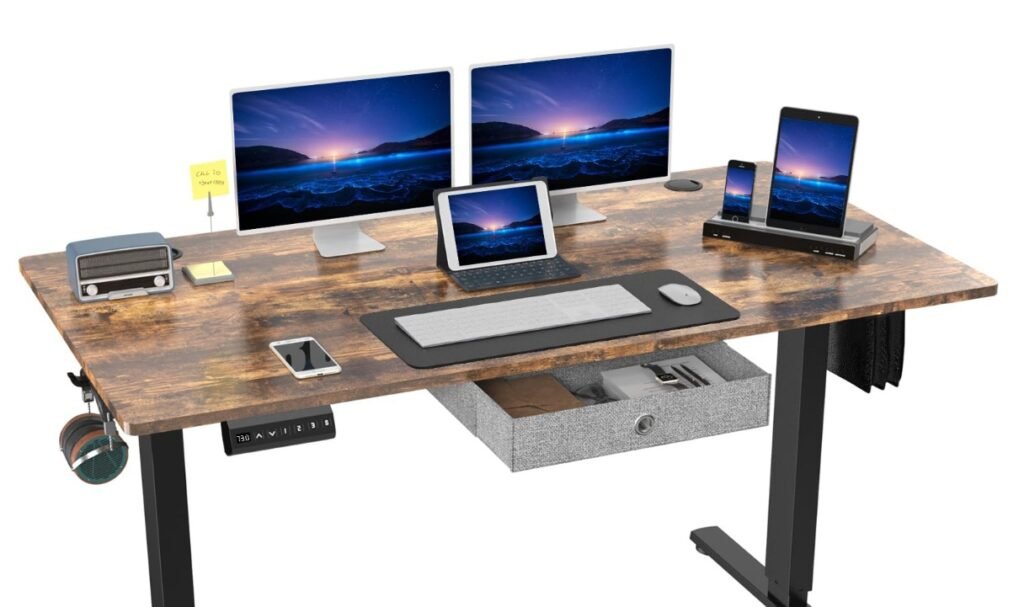
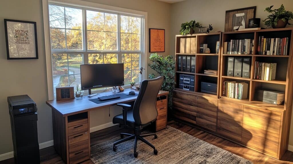
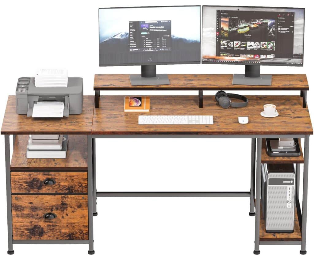
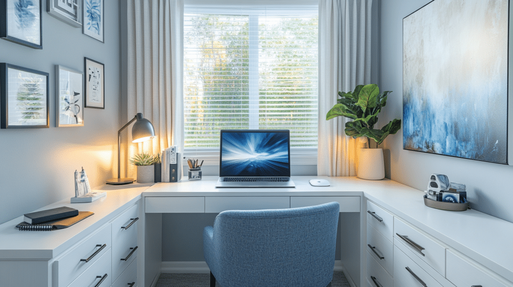
Here’s the question I get asked most by friends setting up a study corner: what do I actually put on this wall? Not “how do I decorate it” in some vague Pinterest sense — what specific things, in what order, so it doesn’t end up either bare and depressing or so busy I can’t concentrate.
I’ve redone the wall above my desk three times. The first version had eleven things on it — a gallery of prints, two clocks, a macrame hanger, string lights zigzagging everywhere. It looked like a mood board threw up. I got rid of most of it within a month because I couldn’t look at my desk without my eyes bouncing around the whole time. The version that finally stuck was boring by comparison: one shelf, one row of three prints, a small pinboard, and a plant. I get more done looking at that wall than I ever did with the “aesthetic” one.
That’s the real lesson with study room wall decor: it’s not a gallery wall project, it’s a functional design project that happens to also look good. Here’s how to actually build one.
What Kind of Project This Is
Time: A simple refresh — a few framed prints, a corkboard, one shelf — takes 1 to 3 hours. If you’re painting an accent wall, mounting floating shelves, or wiring in LED strips, budget 4 to 8 hours, probably split over a weekend because paint needs drying time between coats.
Cost: You can do a real refresh for $30–$150 — a corkboard, some clips, two or three posters from a print shop. A fuller setup with framed art, real shelving, and lighting runs $150–$500+. Custom wallpaper or built-ins push past that, but most people don’t need to go there. My advice: build it in stages rather than trying to buy the whole wall in one trip. Add a shelf this month, prints next month.
Best for: Small to medium study rooms, a bedroom desk corner, home offices, dorm rooms. Anywhere you’re staring at one wall for hours at a stretch.
Skill level: Framed art and a corkboard is beginner-friendly — anyone can do it in an afternoon. Floating shelves, pegboards, and anything involving wiring for lights climbs into intermediate territory. Nothing here requires an electrician unless you’re doing hardwired sconces.
Seasonal appeal: Year-round. The best study walls are the ones you don’t need to overhaul every season — you just swap out a print or add a plant.
The Style That Actually Works: Functional Minimalism
The direction that keeps winning in study spaces isn’t maximalist or trendy — it’s functional minimalism with a bit of personality. Clean lines, one focal wall, everything on it doing a job. Not “empty room” minimalism — there’s still art, still color, still warmth. But nothing’s up there just to fill space.
Colors that work: soft neutrals, warm white, beige, sage green, muted olive, navy, dusty blue, a touch of terracotta if you want warmth. I painted my study wall a warm greige (Benjamin Moore’s “Revere Pewter” if you want the exact can) and it’s the single best decor decision I’ve made in that room — it recedes just enough that whatever’s on the wall pops without the wall itself competing for attention.
Materials that fit the mood: wood, cork, matte-black metal, felt, acrylic frames, and paper prints. Skip glossy finishes on big surfaces — they throw glare when you’re trying to read.
Who this is for: students, remote workers, anyone doing focused work at a desk, kids’ homework corners. If the wall’s job is to support concentration instead of decorating a living room, this approach is the one.
The Must-Have Pieces
Three things carry almost every good study wall. Skip any of them and the wall either looks incomplete or stops being useful.
1. Wall-mounted storage — your hero piece
This is non-negotiable if your desk has zero drawer space or you’re drowning in textbooks. Pick one:
– Floating shelves (12–24 inches wide, mounted 12–16 inches above the desk) for books and small objects
– A pegboard if you want infinite reconfigurability — hooks, small shelves, clips
– Box shelf grids — I like these because they double as display and storage in the same footprint
I went with two oak floating shelves, 24 inches each, stacked with about 10 inches between them. Enough clearance for a stack of books plus a small plant on top.
2. Framed art or prints, kept tight
Don’t do a sprawling twelve-piece gallery wall in a study — save that energy for a hallway. Pick one large print, or a row of two to three framed pieces with a consistent color story. I run three 8×10 botanical prints in identical thin black frames, evenly spaced, centered over my desk. Simple, and it reads as intentional instead of accumulated.
3. A pinboard, corkboard, or whiteboard
This is the piece people skip and regret. You need somewhere for the stuff that changes weekly — deadlines, sticky notes, a printed schedule — so it doesn’t end up taped directly to the wall (don’t ask how I know). A 16×20 cork tile board runs about $15–25 and instantly makes the whole wall feel more organized.
Complementary pieces once the essentials are in:
– Lighting: a warm LED strip along the underside of a shelf, or a small wall sconce — skip cool-white bulbs, they make a study wall feel clinical
– One plant: a small pothos or snake plant on a shelf, or a wall-mounted planter if shelf space is tight
– Maps, diagrams, subject-relevant prints: a vintage map, a periodic table print, a botanical chart — these read as decor and as intellectually “on theme,” which is a nice trick for a study space specifically
How to Actually Put It Together
Think of the wall in three layers: background, mid-ground, foreground.
– Background = your paint color or wallpaper. Decide this first because everything else gets chosen against it.
– Mid-ground = the shelf, pegboard, or gallery row. This is your structure.
– Foreground = lights, plants, small objects. This is the last 10% that makes it feel finished.
Work in that order. I’ve watched people buy the fun stuff first (fairy lights, cute frames) and then try to retrofit a shelf around it — it never sits right because the structure should come before the decoration.
A few numbers that matter:
– Limit yourself to 2–3 main colors plus neutrals. More than that and the wall starts to visually compete with your work.
– Center main artwork around 57–60 inches from the floor, or keep the bottom edge 8–12 inches above your desk surface — high enough that it doesn’t feel cramped, low enough that it’s still part of your sightline while seated.
– Leave negative space. A wall that’s 70% full looks more considered than one that’s 100% full. This was the hardest lesson for me — I kept wanting to fill every gap, and the wall got worse every time I did.
Where to Spend, Where to Save
Spend on:
– Shelf brackets and hardware — cheap ones sag under book weight within a year
– Frames, if you’re doing a visible focal row — mismatched dollar-store frames read as cheap even with good prints inside
– One good light source — a warm LED strip with a dimmer is maybe $25–40 and changes the whole mood of the wall at night
Save on:
– The prints themselves — a lot of great study-wall art is free (public domain botanical illustrations, old maps) or a few dollars from print-on-demand sites
– The pinboard — a basic cork tile set is fine, you don’t need a designer version
– Plants — propagate a cutting from a friend instead of buying a mature plant
Mistakes I See Constantly (and Made Myself)
– Decorating every wall instead of one. Pick the wall you actually face while working and put your energy there. The side walls can stay quiet.
– Too many colors. If your wall has five different accent colors between prints, plants, and frames, your eye never settles. Pick your palette before you buy anything.
– Hanging art too high. I did this in my first attempt — art centered at “gallery height” for a living room, which is too high for a seated desk view. It disconnected the art from the workspace completely.
– Buying decor with no function. A big decorative mirror might look nice, but in a study, that’s prime real estate that could’ve been a shelf.
– Skipping proper hardware. Floating shelves loaded with hardcover textbooks need real wall anchors, not the plastic clips that come in the box. Learned this one when a shelf came down at 11pm with a stack of library books on it.
– Letting it get cluttered again. Give the wall a five-minute reset weekly — dust, restack, take down anything you’re done with. Study walls accumulate paper fast.
Keeping It Consistent Over Time
Pick one or two materials and repeat them — wood and black metal, or cork and white frames — rather than mixing five finishes. This is what makes a wall built in stages over six months still look like one coherent idea instead of a pile of separate purchases.
Seasonal refresh, without redoing the whole thing:
– Swap the prints out with the seasons or when you get bored — keep the frames, change what’s inside them
– Rotate the plant or add a small seasonal object to a shelf
– Change one pinboard photo instead of the whole board
A few directions depending on your taste:
– Minimalist + natural: neutral wall, oak shelf, one plant, one nature print — quiet and calm
– Academic: whiteboard, grid shelf, a map, framed charts — feels like a study space and not an afterthought
– Warm and atmospheric: soft accent wall color, warm LED strip, a tight gallery row, a small pegboard for notes
– Moody: matte navy or olive wall, brass hardware, dark-framed art — works well if your study room gets good natural light during the day, since darker walls need it
The wall above your desk is the thing you’ll look at more than almost anything else in your house over the next year. Worth getting right the first time, or at least getting close enough that your third attempt is a small tweak instead of a full teardown.
For another angle on this, my study room wallpaper guide covers the same space from a different starting point.