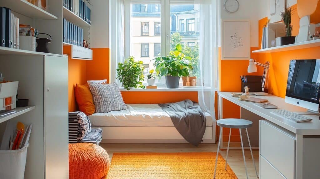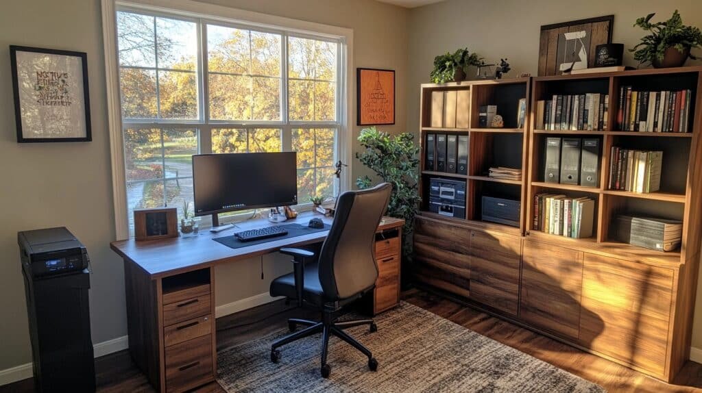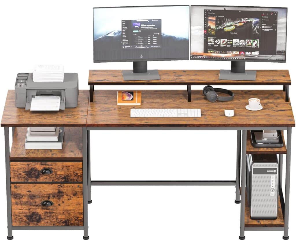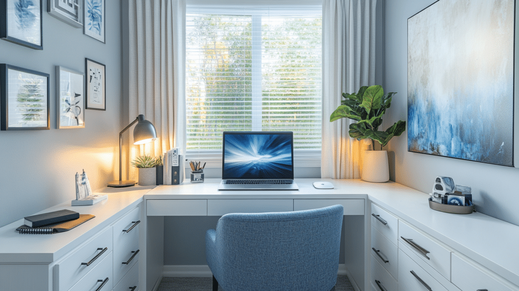
What This Look Actually Is
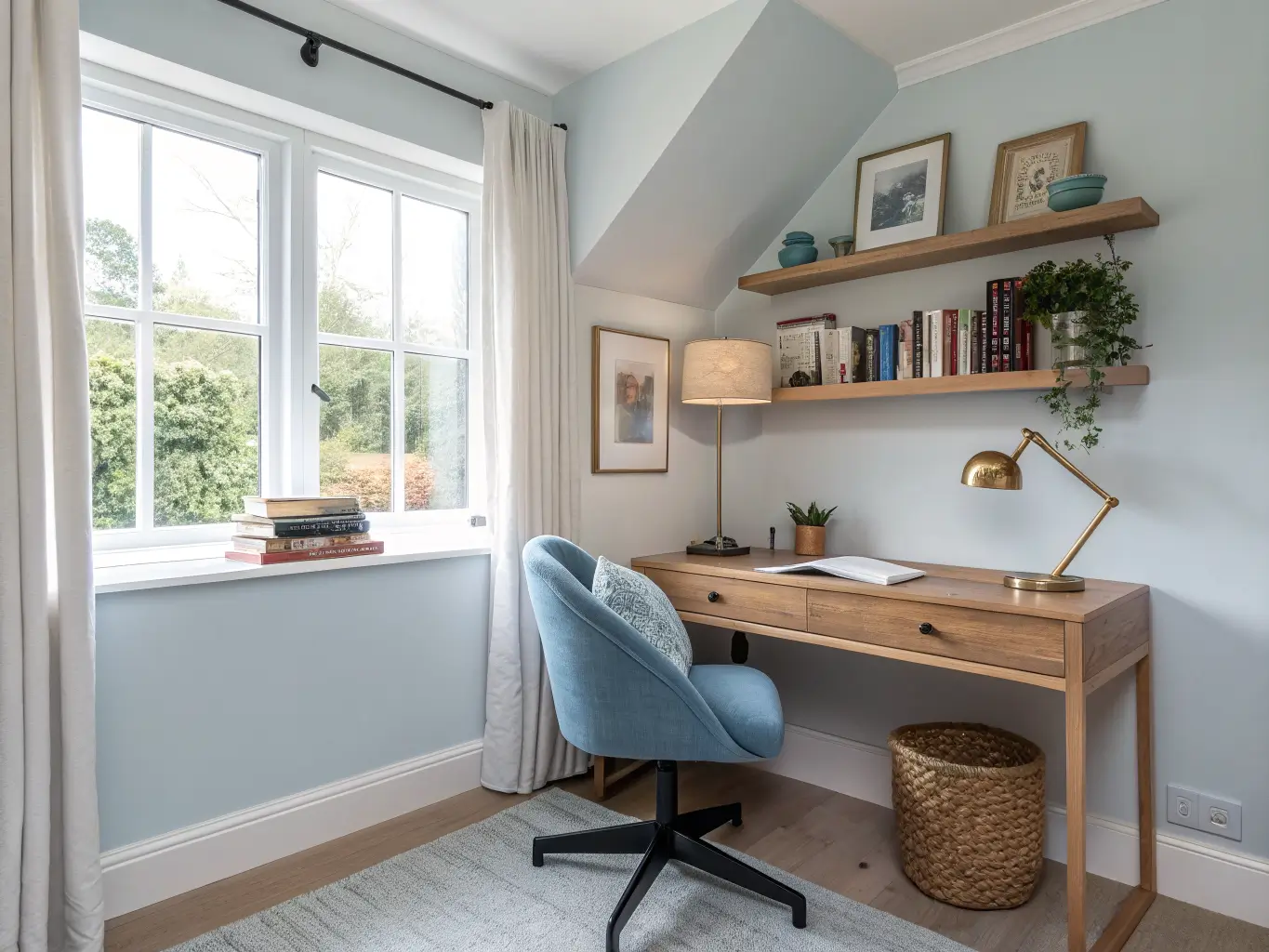
This isn’t a decorating style with a name, like farmhouse or mid-century. It’s more of a functional palette — muted, low-saturation color schemes borrowed from minimalist and biophilic design, built specifically for spaces where you need your brain to settle down and stay on task.
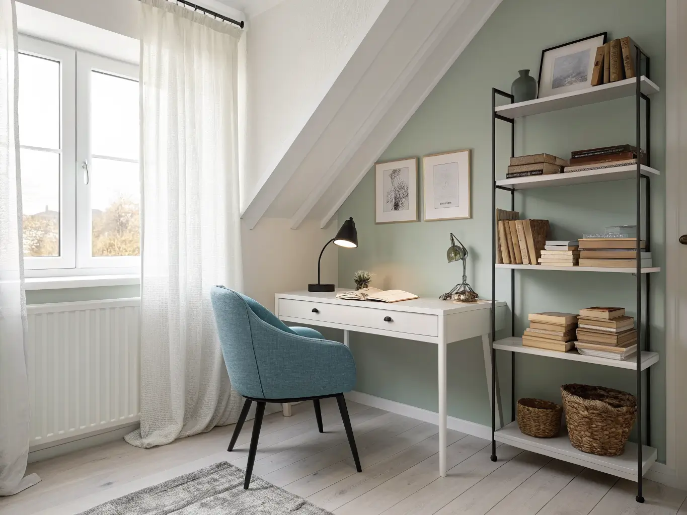
Think soft blues, sage and olive greens, warm neutrals like greige and taupe, with maybe one deeper accent color doing quiet work in the background. Light wood, matte finishes, linen textiles. Nothing shouting for attention.
It’s for students who study better away from noise, remote workers who sit in the same four walls for eight hours a day, and anyone who’s tried to read in a room that felt too stimulating or too sterile to relax into. It works in home offices, spare bedrooms converted into study nooks, and those awkward alcove spaces every apartment seems to have one of.
Project Basics: Time, Cost, and Skill Level
Before you pick swatches, know what you’re actually signing up for.
Time: A simple repaint plus basic styling takes 1–3 days. If you’re adding a feature wall, new shelving, task lighting, and a proper desk setup, budget 1–2 weeks.
Cost:
Paint-only refresh: $80–$250 for a small room (1–2 gallons, brushes, rollers, tape). Design-forward paint brands run higher than contractor-grade stuff.
Mid-range overhaul: $300–$1,200 if you’re adding a desk, task lamp, art, storage, and a rug.
Full refresh: $1,500+ once you bring in built-ins, specialty paint finishes, or custom lighting.
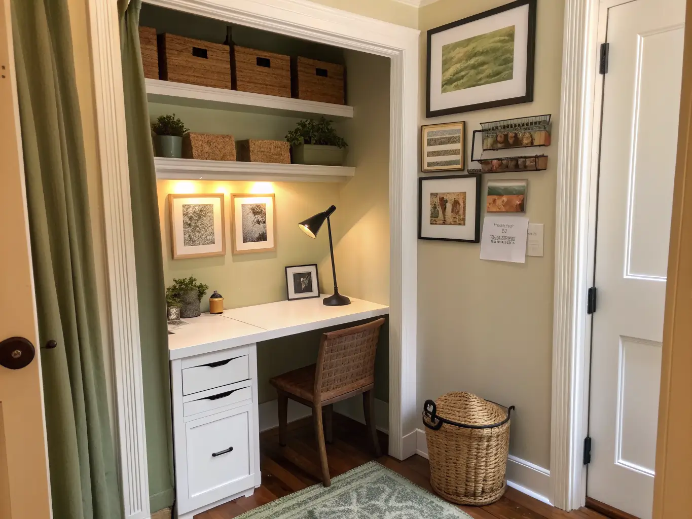
Best room size: Small to medium. This palette approach is basically designed for compact spaces — a spare bedroom, a converted closet, a corner of the living room.
Skill level: Beginner-friendly if you’re just repainting. Two-tone walls, accent panels, and built-ins push you into intermediate-to-advanced DIY territory.
Seasonal appeal: Year-round. Muted greens, soft blues, and warm neutrals aren’t trend-chasing colors — they hold up in every season, which matters if you’re not repainting twice a year.
The Colors and Materials That Define This Palette
Core wall colors:
Soft blues — powder blue, blue-gray, sky blue
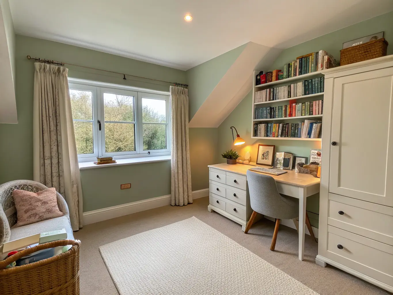
Muted greens — sage, mint, olive
Warm neutrals — off-white, cream, beige, greige, taupe
Accent colors (used sparingly): mustard, terracotta, charcoal, dusty pink, lavender
Materials that make it feel intentional, not just painted: light wood (oak or ash), matte paint finishes, linen and cotton textiles, wool rugs, wood shelving, metal lamp fixtures, cork pinboards.
The materials matter as much as the paint color. A sage green wall next to a glossy black desk reads completely differently than the same wall behind light oak. One feels calm. The other feels like a mismatch nobody signed off on.
Must-Have Pieces for a Study Room That Works
Here’s what actually earns a spot in this room, not filler:
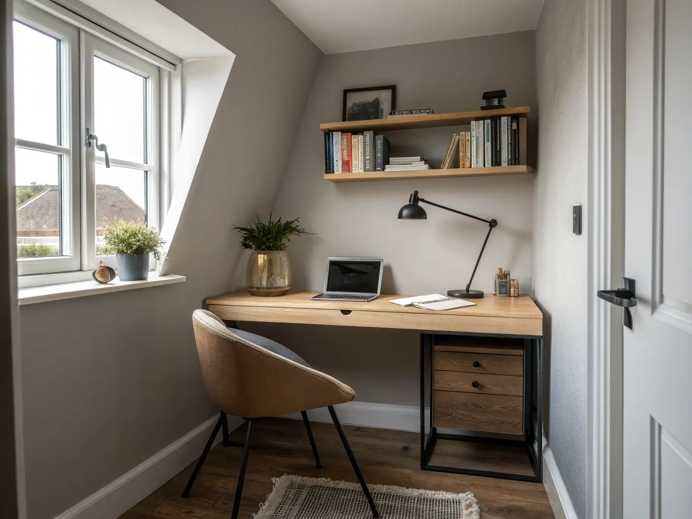
Hero wall color — pick one proven combo: soft blue and white, sage green and beige, warm neutrals on their own, grey and blue, or olive and taupe. Don’t try to invent a fifth option from scratch.
Desk — light oak, ash, or white laminate. Keeps the room bright even when the walls go deeper.
Task chair — grey, beige, white, or muted blue upholstery. This is not the place for a bold pattern.
Lighting — an adjustable-arm desk lamp or warm LED task light. Bright enough to read by, warm enough not to feel clinical.
Storage — floating shelves, a slim bookcase, or closed drawers in white, wood, or matte black.
Soft finishes — a small rug, linen curtains, a cork pinboard. These add texture so the room doesn’t feel flat.
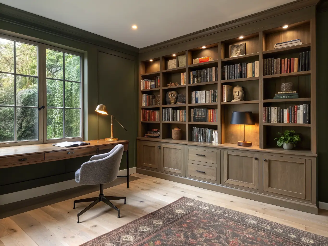
One signature accent — an accent wall panel, a framed art cluster, or a desk backdrop in charcoal, forest green, or navy. This is your contrast note, and you only need one.
Optional Add-Ons Worth Considering
Once the basics are in place, these upgrades sharpen the room without cluttering it:
Seasonal swaps — cushions, desk trays, or art in mustard, rust, blush, or deep green for quick refreshes without repainting
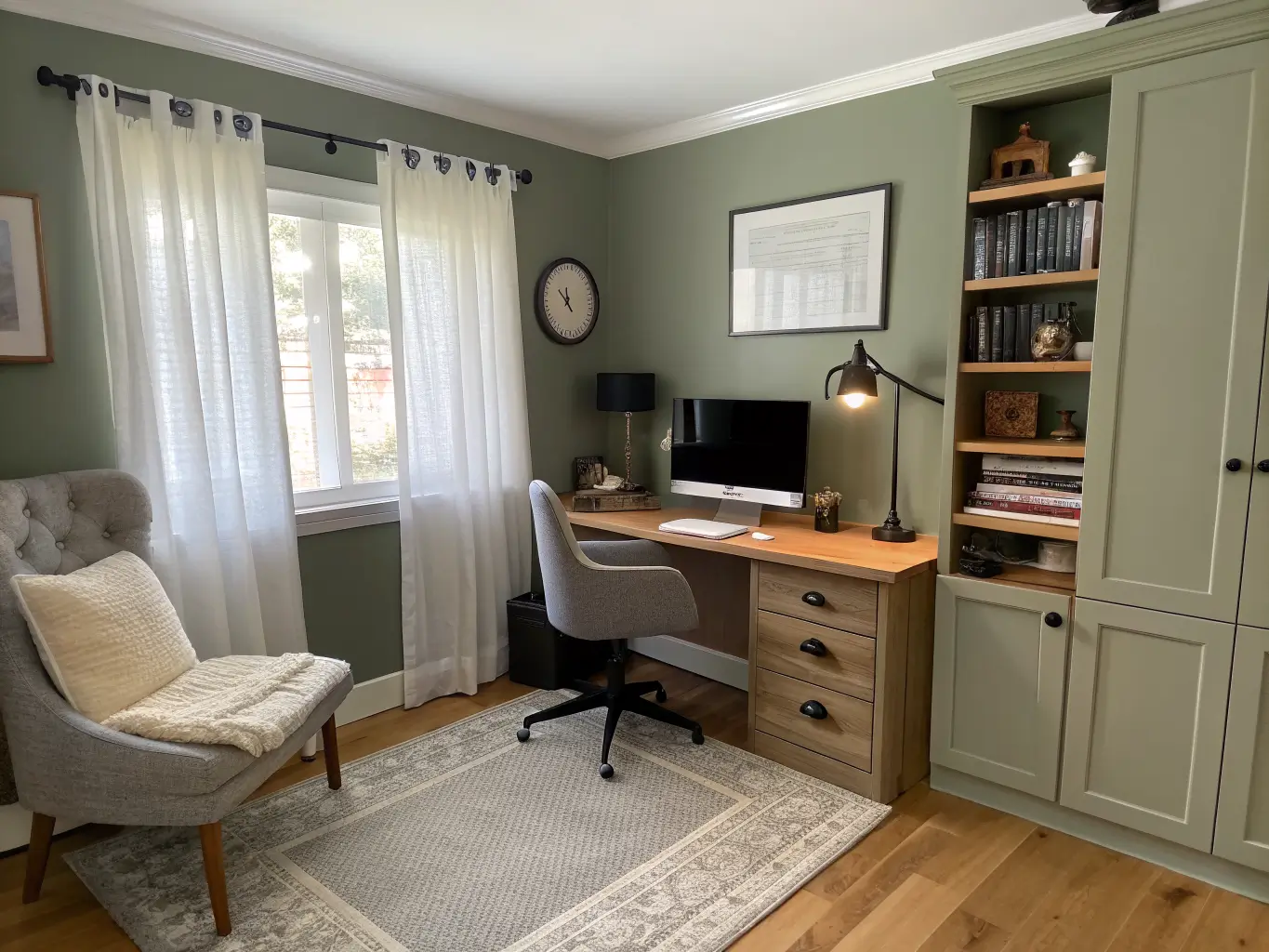
Organic touches — a potted plant, dried stems in a vase, a woven basket for supplies, a wood tray on the desk
Metallic details — brass lamp fittings, black metal shelf brackets, satin hardware on drawers
Feature wall treatments — two-tone walls, horizontal color blocking, or a dark accent panel positioned right behind your monitor to cut glare and reduce visual noise while you’re staring at a screen for hours
That last one is underrated. I added a charcoal panel behind my monitor about a year in, and it made a bigger difference to eye strain than any lamp I bought.
How to Actually Put the Room Together
Start with the wall color, not the furniture. I made this mistake in reverse the first time — bought a desk I loved, then spent three weekends trying to find a paint color that didn’t fight with it. Backwards. Pick the wall color first, then build around it.
Use a rough 60-30-10 split. Sixty percent your base color (usually the walls), thirty percent a secondary tone (your furniture and floor), ten percent accent (art, textiles, one bold object). This keeps the room from feeling overdesigned, which is a real risk once you start liking a palette and want to use it everywhere.
Keep the ceiling lighter than the walls. Even a shade or two lighter keeps the room feeling open instead of boxed in — this matters more than people think in a small room.
In small rooms, run one continuous color across walls and built-ins. Breaking up the color with contrasting shelving or trim makes a small room look choppier and smaller, not more interesting.
Balance cool with warm. If your walls are a cool blue or grey-green, bring in warm materials — oak desk, beige linen curtains, a jute rug. Cool walls with cool furniture and cool lighting reads sterile fast. This was my original mistake, almost exactly.
If you want a bold color, cap it at 10–20% of the wall area. Use it as a backdrop panel or on a single shelf wall, not across the whole room. Full-wall saturated color in a workspace tends to work against you, not for you.
Setting Up: Step by Step
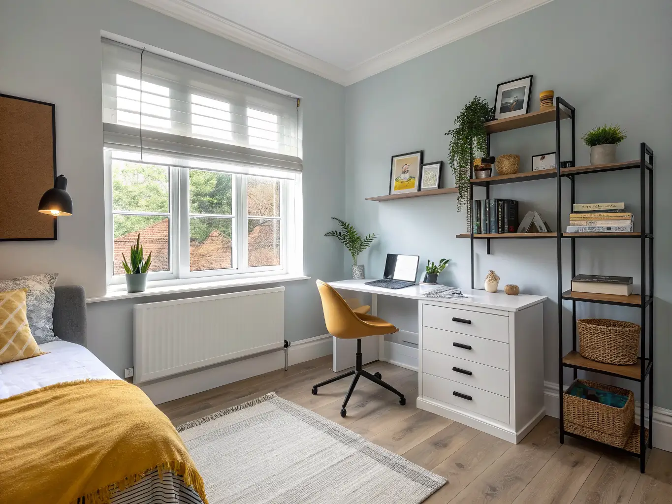
1. Figure out what the room needs to do. Focus-heavy work? Creative work? Quiet reading? The answer shifts your palette — blues and greys lean toward focus, greens and warm neutrals lean toward calm reading, and if creativity is the goal you can push slightly bolder with an accent wall.
2. Assess your light before you commit to paint. A north-facing room with limited daylight needs lighter tones — powder blue, cream, soft sage. A larger room with good light can handle something deeper, like an olive or a dusty terracotta, without feeling cave-like.
3. Pick your finish deliberately. Matte or eggshell on the walls cuts glare, which matters more in a study room than almost anywhere else in your house — you’re staring at these walls for hours, often next to a bright screen. If you want a slightly tougher finish on trim or a accent panel, go satin, but keep the main wall surface low-sheen.
4. Test the paint on multiple walls, at different times of day. This sounds excessive until you’ve watched a “soft sage” turn distinctly grey-green by 4 pm and back to a warm sage by morning. Blues and greens are the worst offenders for this. Tape up samples on at least two walls and check them morning, midday, and evening before you commit to gallons.
5. Paint the main color first, then bring in furniture in your secondary tone — wood, white, or grey, whatever you picked for the 30% slot.
6. Establish one focal point. The desk wall, a bookshelf backdrop, or a small framed art cluster. Just one. Trying to make every wall a moment is what turns a calm room into a busy one.
7. Layer in desk accessories with restraint. A lamp, a notebook tray, a pen cup, one plant. That’s genuinely enough for most small study spaces — I’ve tried the fully-styled desk with the stack of design books and the ceramic tray and the succulent trio, and I spent more time tidying it than using it.
8. Add accent color through textiles and art, not paint. A mustard cushion or a framed print does the same visual job as an accent wall, with way less commitment and way less risk of it looking dated in two years.
Mistakes That Undercut a Study Room
Painting every wall in a saturated, bright color. It looks bold in photos and becomes genuinely hard to sit with for four hours straight. Saturation and focus don’t mix well.
Going all-white with no warmth. This was my original room. All-white without wood tones or texture reads clinical, not calm — there’s a difference between “clean” and “cold,” and stark white with no counterbalance lands on cold.
Ignoring paint finish and lighting together. A glossy wall finish under a harsh overhead light will glare back at your screen all day. Matte finish, warm-toned bulbs, problem solved.
Overloading the desk wall. Too many frames, too many shelves, too many objects in your direct sightline — it defeats the entire point of a low-distraction room.
Matching everything too perfectly. A room where the desk, walls, chair, and shelving are all the same tone of beige looks flat, not serene. You need at least one point of contrast — a darker frame, a black lamp, a patterned rug corner — or the whole thing goes visually dead.
Keeping It Consistent and Fresh Over Time
Stick to 2–3 core tones and repeat them everywhere — walls, textiles, one accent piece. Consistency reads as intentional; randomness reads as unfinished.
Pick one metal finish and one wood tone, and stay loyal to them. Mixing brass and brushed nickel and black metal in the same small room is a fast way to make it feel unplanned, even if every individual piece is nice.
Seasonal refreshes without repainting:
Spring/summer: sage, mint, light blue, soft white accents through cushions and art
Fall/winter: olive, taupe, terracotta, charcoal, warm beige through textiles and desk accessories
Swapping a lamp shade, a set of pillow covers, or a stack of art prints costs under $50 and changes the whole feel of the room without touching a paint can.
If you want to pull in a broader style, this palette flexes well:
Boho + study: sage, beige, rattan storage baskets, linen curtains
Modern + study: grey-blue walls, white trim, black metal shelving
Natural/minimal + study: cream walls, light wood furniture, one muted green accent
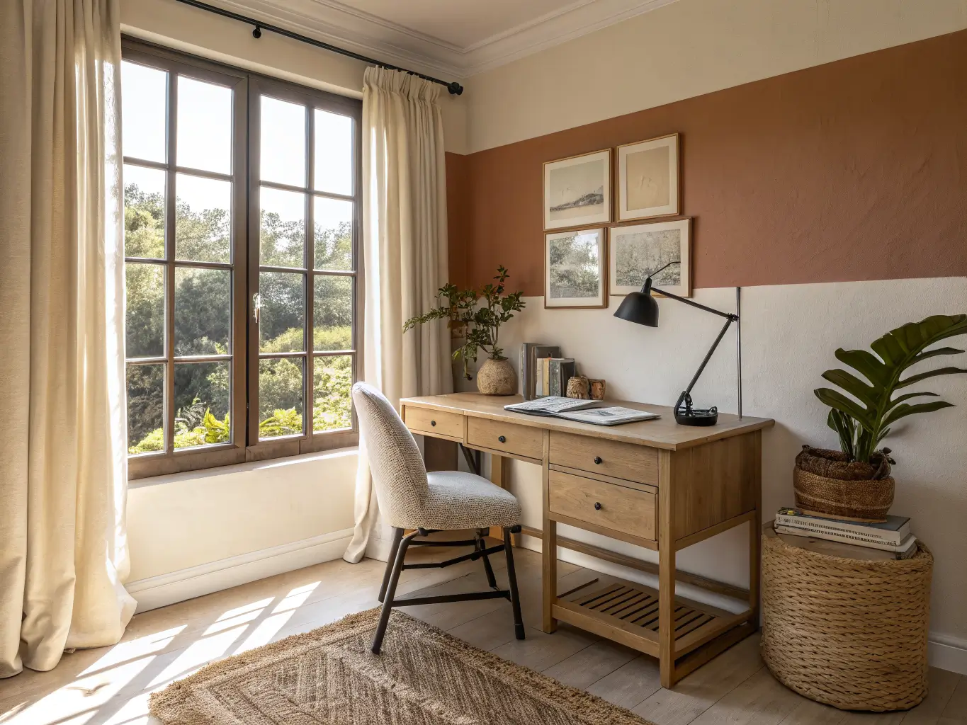
Earthy contemporary + study: terracotta accent wall, olive textiles, taupe base
I ended up somewhere between the natural-minimal and earthy-contemporary versions — cream walls, oak desk, one terracotta cushion on an otherwise plain chair. Took me two failed paint colors and one regretted glossy-black desk to get there, but the room finally feels like somewhere I want to sit for three hours, not somewhere I’m sentenced to.
For another angle on this, my study room wall decor guide covers the same space from a different starting point.