What a Moody Study Actually Looks Like — And Who It’s For
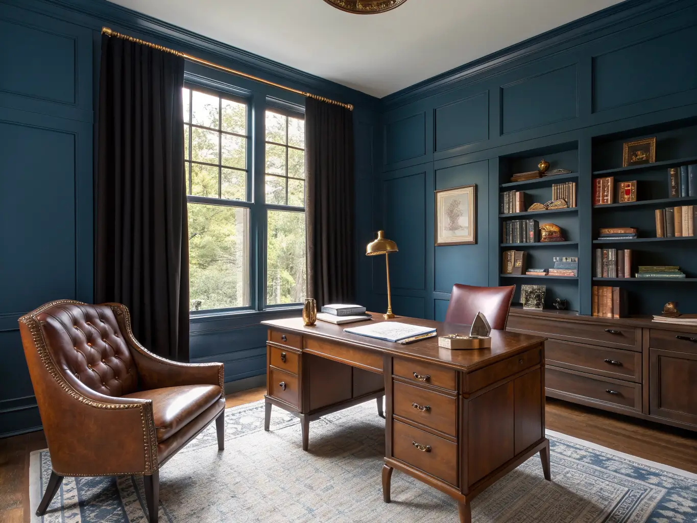
This isn’t just dark paint in an office. A moody study room borrows from old libraries and gentleman’s clubs — deep color, warm wood, leather, brass — and mixes it with whatever era you actually live in. Mine has a mid-century desk next to a wingback chair that’s older than I am, found at an estate sale for $60.
The palette: deep navy, charcoal, inky indigo, emerald, blackened plum, tobacco brown, walnut brown.
The materials: dark-stained wood, leather, velvet, brass, marble, iron, wool, cane.
This style is for people who actually want to be in the room — readers, writers, remote workers, collectors, anyone who finds all-white minimalism a little sterile for a space where you’re supposed to think. It works in a full room, a 10×12 den, or a leftover nook under the stairs. Size isn’t the limiting factor. Light and layout are.
Setup Time and Real Costs
A paint-and-decor refresh is a weekend project. Add wallpaper, built-ins, or trim work and you’re looking at one to two weeks, mostly because of drying time between coats and the patience required to cut in around trim without slopping charcoal paint onto your ceiling (ask me how I know).
Budget breaks down roughly like this:
– Budget refresh — $250 to $800: paint, one good desk lamp, a chair swap, some art, storage bins. This is most of what you need.
– Mid-range redesign — $1,200 to $4,000: a solid wood desk, an upholstered chair, real bookshelves, layered lighting, a rug, and a proper wall treatment.
– Higher-end/custom — $5,000+: built-ins, custom cabinetry, wallpaper, designer lighting and seating.
You do not need the top tier to get the look. My own room cost closer to $900 total, and most of that was the chair.
Skill level: beginner to intermediate for paint and furniture. Expert-level only if you’re doing built-ins or color-drenching trim and ceiling — that’s a job where uneven cutting-in shows immediately in a small room.
This style reads best in fall and winter, when the dark walls and warm lamps feel protective instead of closing-in. But it holds up year-round if the lighting is right, which is the part everyone underestimates.
The Must-Have Pieces
A dark wall color or wallpaper. This sets the tone before anything else goes in the room. Go matte or eggshell, never glossy — gloss on a dark wall in a small room bounces light in a way that looks cheap. I used Farrow & Ball’s Hague Blue; Benjamin Moore’s Hale Navy and Kendall Charcoal are easier-to-find equivalents at a third of the price.
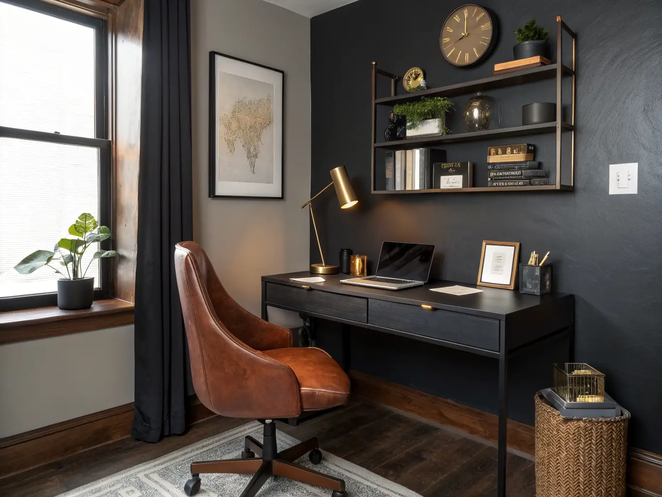
A substantial desk. Wood, black lacquer, or dark stain. Skip anything that feels like a laptop stand. The desk needs to hold visual weight in a dark room, or the whole space feels underfurnished.
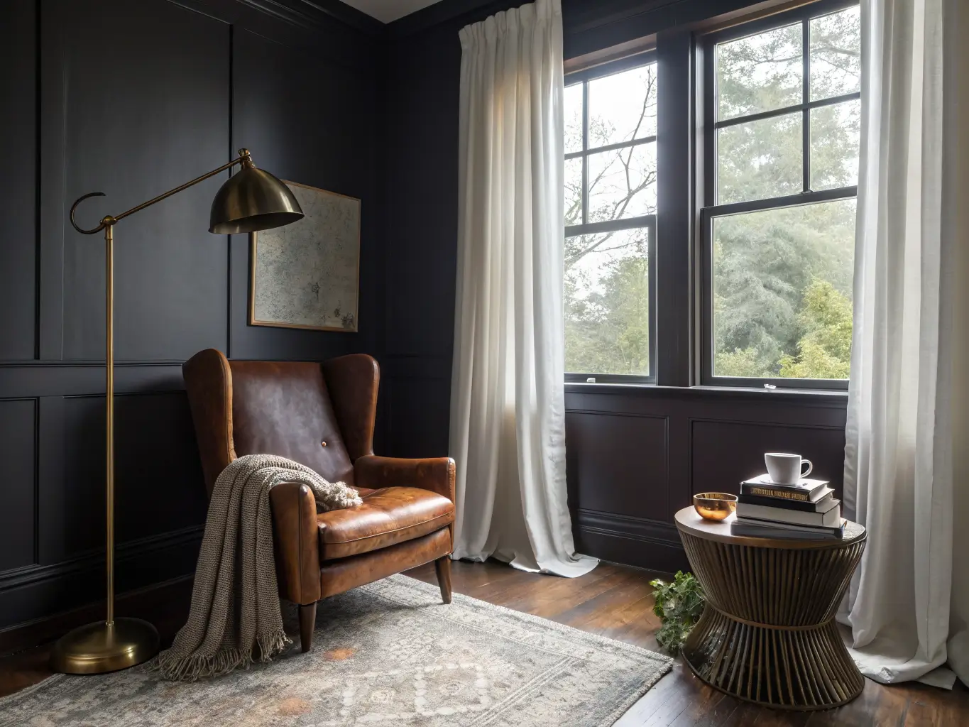
An upholstered chair. Leather, velvet, or bouclé. This is where comfort meets texture — you’re going to be in this chair for hours, so don’t buy something that photographs well and sits like a park bench.
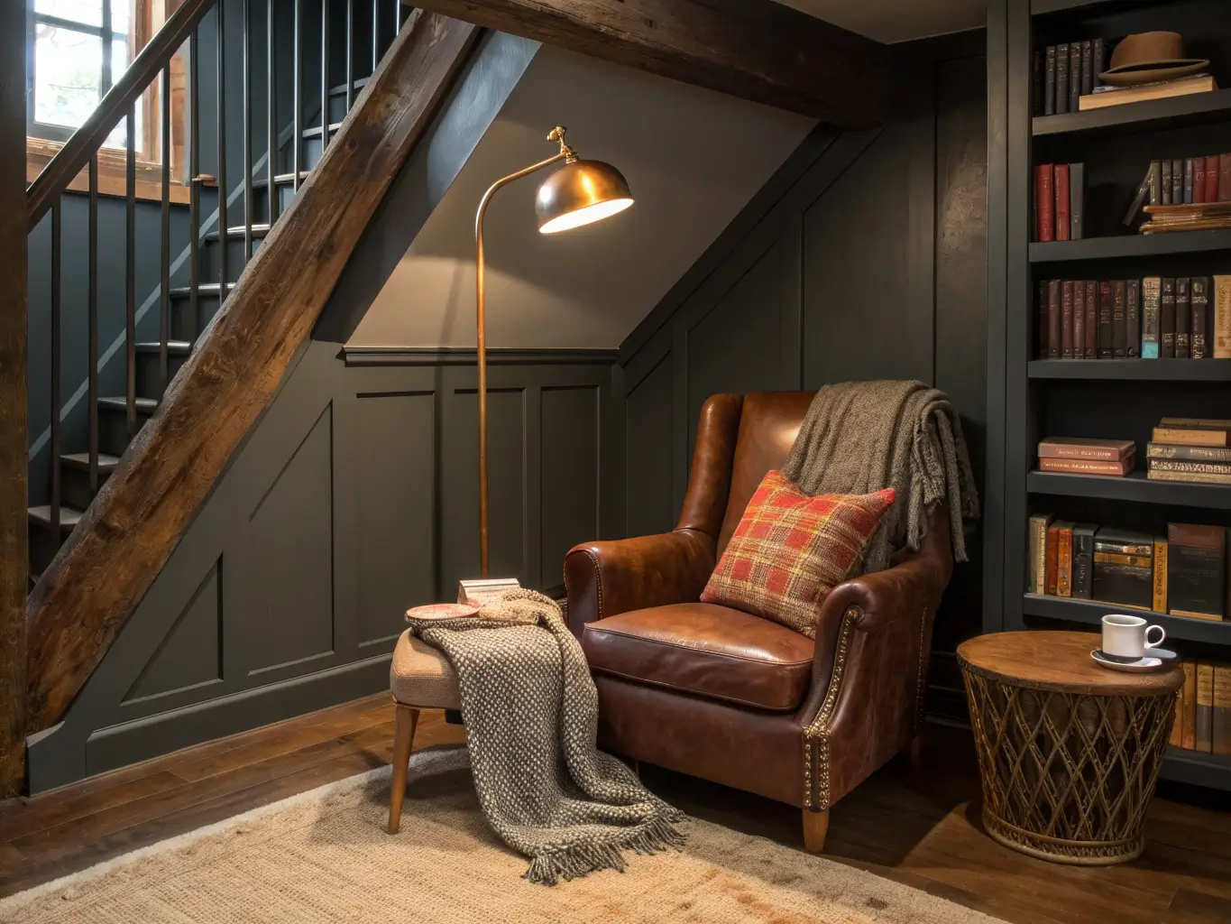
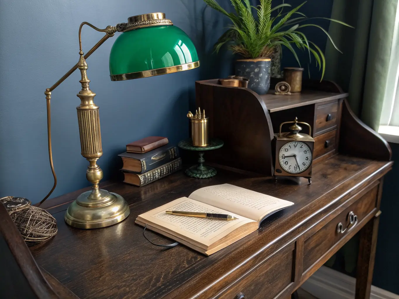
Warm task lighting. Non-negotiable. Brass desk lamps, picture lights over art, floor lamps with warm (2700K, not daylight) bulbs. This is the single thing that separates “moody” from “dim and depressing”.
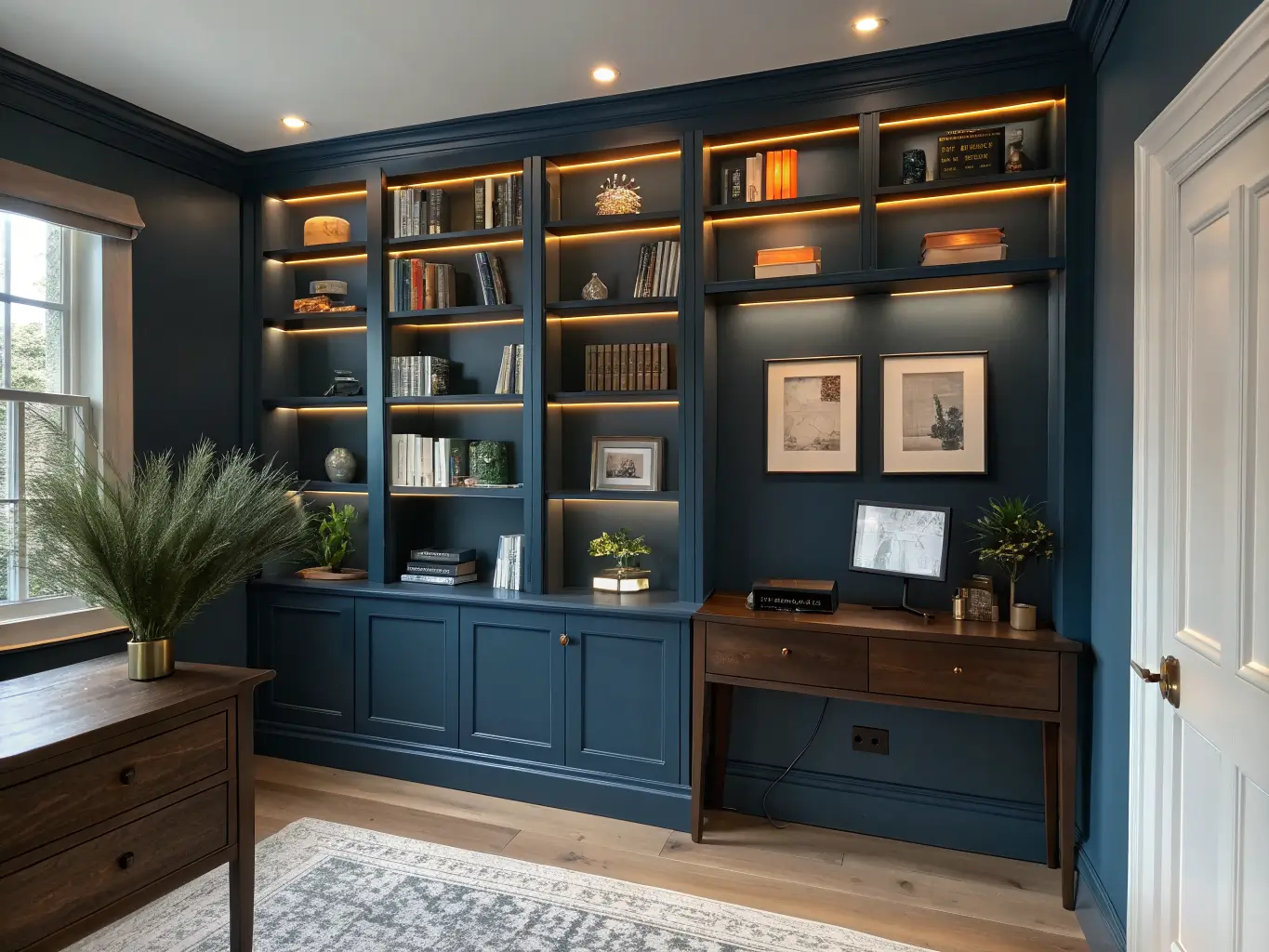
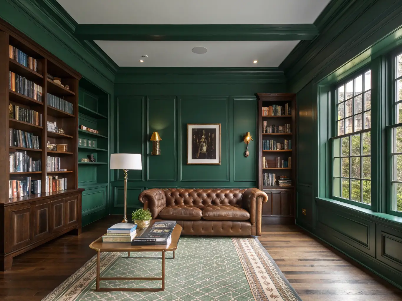
Bookshelves or built-ins. Floor-to-ceiling if you can swing it. This is what makes the room read as a library instead of an office that happens to be dark.
A textured rug. Wool, plaid wool, or a dark woven flatweave. Hard floor plus dark walls plus no rug equals a room that echoes and feels cold.
Art with visual weight. Framed paintings, maps, black-and-white photography, folk art. Small, thin-framed prints disappear against dark walls — go bigger and heavier-framed than you think you need.
Optional Layers That Push It Further
– Patterned wallpaper — dark florals or damask add softness without lightening the mood
– Metallics — brass, aged gold, antique bronze; these keep the room from feeling flat
– Velvet pillows, wool throws, a sheepskin on the reading chair
– Plants, woven baskets, cane-front cabinets to keep all that darkness from feeling heavy
– Color-drenching — same tone on walls, trim, and ceiling — which fakes the look of custom millwork for the price of a few extra gallons of paint
How to Actually Put It Together
Layer at least three textures in every sightline. One smooth surface, one soft textile, one tactile natural material. Wood desk, velvet chair, wool rug. Lacquered bookshelf, leather chair, brass lamp. If a corner of the room is all one texture, it reads flat no matter how good the color is.
Balance the dark walls with warm light, always. This is the rule that fixes 90% of “why does my moody room feel like a cave” complaints. Skip harsh overhead lighting entirely. Use amber-toned lamps and picture lights instead. I have three light sources in my study and zero overhead — a brass desk lamp, a floor lamp in the reading corner, and a picture light over a large botanical print. None of them are daylight-temperature bulbs.
Pick one focal point. A full bookshelf wall, one statement lamp, a grouped gallery of framed art. Pick one and let the rest of the room support it quietly.
Keep the palette tight. One dominant deep color, two or three supporting neutrals or metals. My room is blue, brass, and walnut. That’s it. The temptation with a moody room is to keep adding “one more” jewel tone, and that’s how you end up with a room that looks chaotic instead of dramatic.
Leave some negative space. A shelf that’s completely full looks cluttered even in daylight; in a dark room it looks chaotic. Leave breathing room between object groupings.
Setting Up the Room: A Step-by-Step
1. Decide the room’s job first — work-first study, reading room, or hybrid. This decision changes desk size, seating choice, and shelving depth before you buy anything.
2. Measure before you shop. Desk depth, chair clearance, shelf height. A compact study does better with a slim desk, wall sconces instead of floor lamps, and narrow shelving rather than trying to cram in oversized furniture.
3. Paint first. Walls and trim in matte or eggshell — deep blue, green, charcoal, or plum. The paint sets the tone everything else responds to, so don’t buy furniture before you’ve committed to a color.
4. Bring in the anchor piece next — desk or reading chair, whichever is larger. This gives the room a visual center of gravity.
5. Place task lighting so the work surface is genuinely bright enough to use, while the rest of the room stays low and warm.
6. Style the shelves selectively — books, a few boxed storage pieces, art, objects. Leave gaps.
7. Finish with a rug, a throw, and one or two brass or gold accents to keep the palette from feeling flat.
Mistakes That Undo the Whole Look
– Dark paint with no real lighting plan. This is the number one failure. If your only light source is an overhead fixture, the room will feel like a cave, not a library. Layer in at least two warm lamps before you judge the color.
– Too many colors or finishes. Moody rooms succeed on restraint. The instinct to add “just one more” accent color is the enemy here.
– A flimsy or undersized desk. It undercuts the scholarly feel the whole style is built on. Go bigger than feels necessary.
– Overstyled shelves. Packing every inch with books and objects creates visual noise, which fights the quiet, focused mood you’re going for.
– Sacrificing comfort for drama. A hard chair that photographs well but hurts your back after an hour defeats the purpose of a study. This is a room you’re supposed to use, not just look at.
Keeping the Room From Going Stale
Stick to one undertone family — cool (navy, charcoal, ink) or warm (tobacco, plum, espresso) — and don’t cross-mix them. Repeat one or two materials throughout, like brass and walnut, so the room reads as one decision instead of several unrelated ones. Edit the shelves and surfaces seasonally instead of letting decor accumulate — I do a real pass every fall and pull anything that’s just sitting there out of habit.
Seasonal swaps that cost nothing:
– Fall: a plaid wool throw over the chair arm
– Winter: heavier drapery if you have windows in the room
– Spring: swap velvet pillows for linen
– Summer: one plant or a small vase of fresh flowers to cut the density
Cheapest real upgrade: paint an existing bookcase the exact wall color so it reads as built-in, then run a warm LED strip behind the top shelf. Costs under $50 and changes the whole feel of the room.
Cross-style variations if you want to push the look:
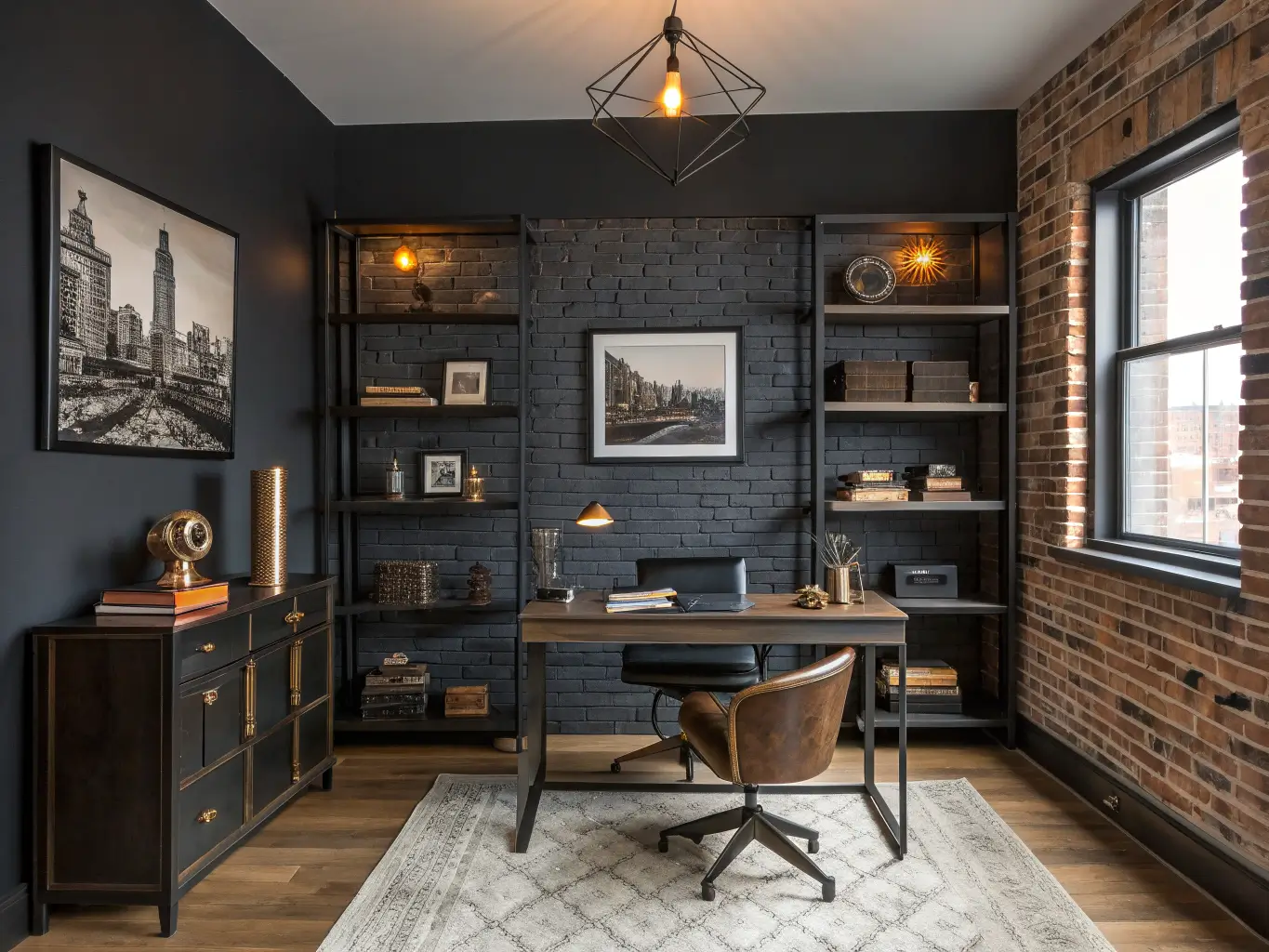
– Moody + Industrial — exposed brick, black metal shelving, Edison bulbs
– Moody + Traditional — antique desk, carved bookcases, brass picture lights
– Moody + Modern — sleek black desk, minimal art, tightly controlled negative space
I still second-guess the paint color some mornings when the room feels a little tomb-like before the lamps go on. Then I turn on the desk lamp, and it clicks back into place every single time. That’s the whole trick with this style — the color does the drama, the lighting does the living.
For another angle on this, my moody home office guide covers the same space from a different starting point.