I painted my home office three times in two years before I got it right. First it was a crisp white because every design blog said white makes small rooms feel bigger. It did. It also made every Zoom call look like I was being deposed. Then I went too far the other way with a navy accent wall that looked moody and rich on Pinterest and felt like a cave by 4pm in January. What finally stuck was a muted blue-green — Sherwin-Williams Pale Moss on three walls, a touch darker on the wall behind my desk. Two years later, I still like walking into that room. That’s the whole point of this article: saving you the repainting.
What Makes a Home Office Color “Work” (It’s Not Just Pretty)
A bedroom or living room just needs to look good. An office has to do more. You’re staring at these walls during video calls, under different light than any other room gets, for hours at a stretch, while trying to concentrate. That’s a different job for paint.
This look is for you if:
– You work from home most days and want the room to actually support focus, not just look nice in photos
– You’re on video calls regularly and want a background that looks put-together without extra effort
– You’ve got a small nook, spare bedroom, or awkward alcove doing double duty as a workspace
– You’re tired of a room that looks fine but feels flat, sterile, or vaguely irritating by midafternoon
Skip the trends and go neutral if your office is also a guest room, kids’ homework station, or storage overflow — you want a base color flexible enough to support multiple identities, not one locked into “focused productivity zone.”
The Colors That Actually Show Up in Good Home Offices
I’ve now tested more paint chips than I care to admit, and there are basically four directions worth considering.
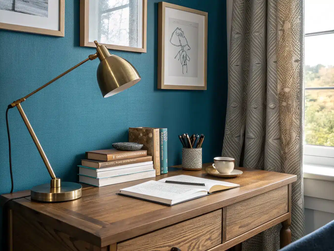
Blues — the safest bet for concentration. Sherwin-Williams Oceanside is a deep, saturated teal-blue that works as a statement wall in a bright room. Azure Tide is softer, more everyday-wearable. Benjamin Moore Beneath the Clouds reads almost gray in low light and blue in daylight — good for rooms with shifting light through the day. If you want blue without commitment, Stonington Gray is technically a gray but leans blue enough to get the calming effect without feeling like a “color.”
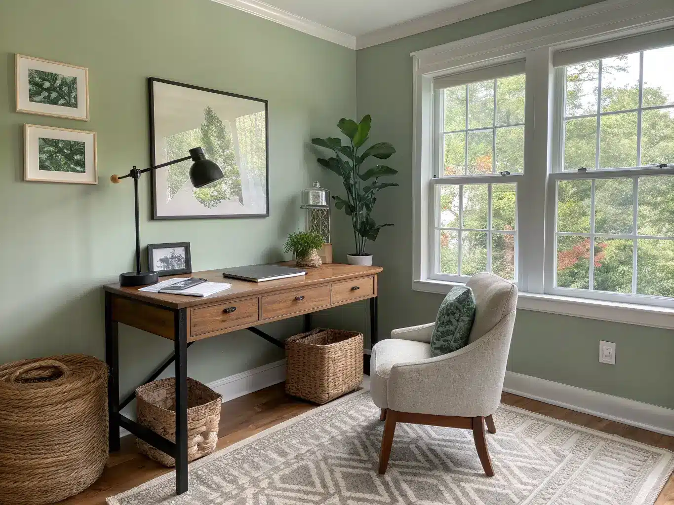
Greens — my personal pick, and increasingly everyone else’s. Benjamin Moore Cushing Green is muted and a little dusty, not minty or bright. Guilford Green is softer still, almost celadon. Sherwin-Williams Pale Moss (what’s on my walls) sits between sage and olive — it doesn’t scream “green” from across the room, it just feels settled. Dried Edamame is warmer and more yellow-green if your room gets cool northern light and needs correcting.
Warm neutrals — the flexible choice. Benjamin Moore Revere Pewter is the paint color equivalent of a good white t-shirt: it goes with everything, photographs well, and never feels like a decision you’ll regret. Sherwin-Williams Alpaca is similar, slightly warmer. If you want something crisper, White Heron or Marshmallow keep things bright without the sterile edge of a true white.
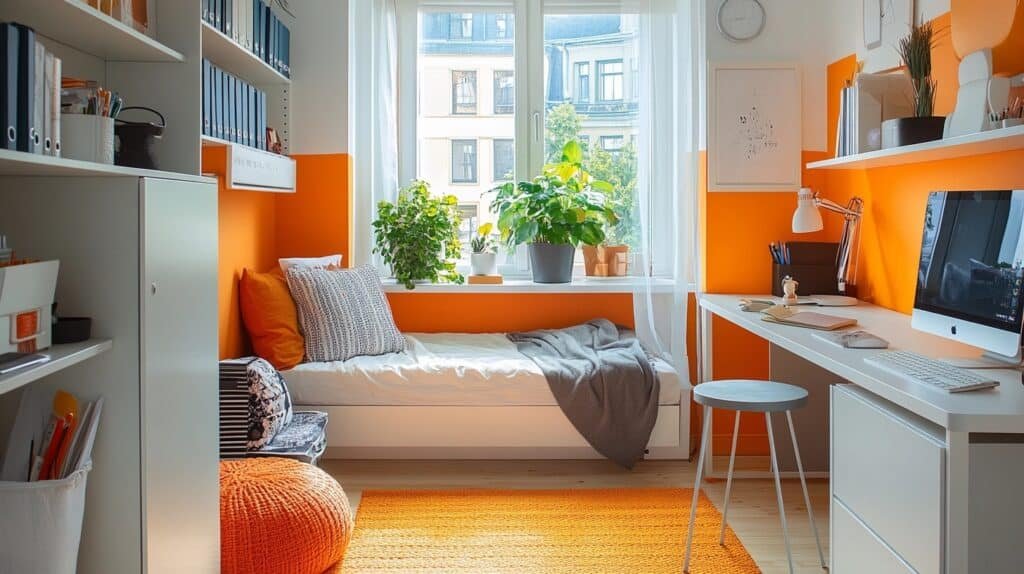
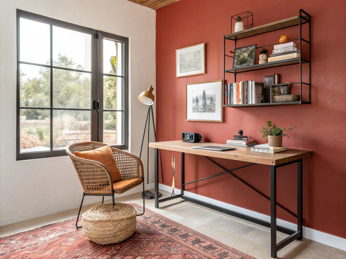
Warm accents — for the person who wants energy, not calm. Benjamin Moore Sunlit Coral or Peruvian Chili work if your office doubles as a creative studio and you want the room to feel alive rather than focused. These aren’t for everyone. I’d never put this on four walls, but as a single accent wall in a large, bright room, it has a place.
How to Actually Choose (Not Just Pick a Pretty Chip)
Test on at least two walls, not one. Office light behaves differently than living room light because you’re usually working near a window or under a desk lamp, and the color shifts depending on where you’re sitting versus where you’re looking. I painted my first sample swatch only on the wall facing the window and it looked entirely different by 6pm when I was working under lamp light instead. Paint two spots — one near natural light, one in the corner where your camera would see it — and live with both for a few days.
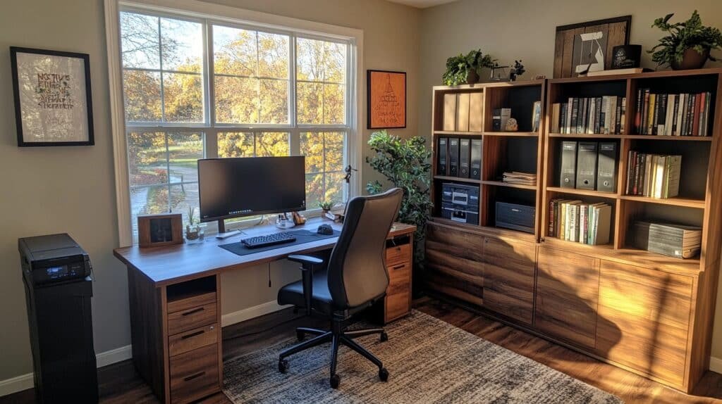
Check it against what’s already in the room. Hold the swatch up next to your desk wood, your chair fabric, your flooring. A cool gray-blue next to a warm honey-oak desk will look off no matter how nice each one is alone. Match undertones: warm wall colors with warm wood tones, cooler colors with black metal, white, or ash finishes.
Sample in daylight and after dark. A color that reads soft and blue-gray at noon can go flat and muddy under a warm-toned desk lamp at night. If you work evenings, this matters more than almost anything else on this list.
Small or Windowless Office? Go Lighter, Not White
If your office has no window or gets weak northern light, the instinct is to go white for brightness. Don’t. Flat, cold white in a windowless room just looks institutional — like a waiting room, not a workspace.
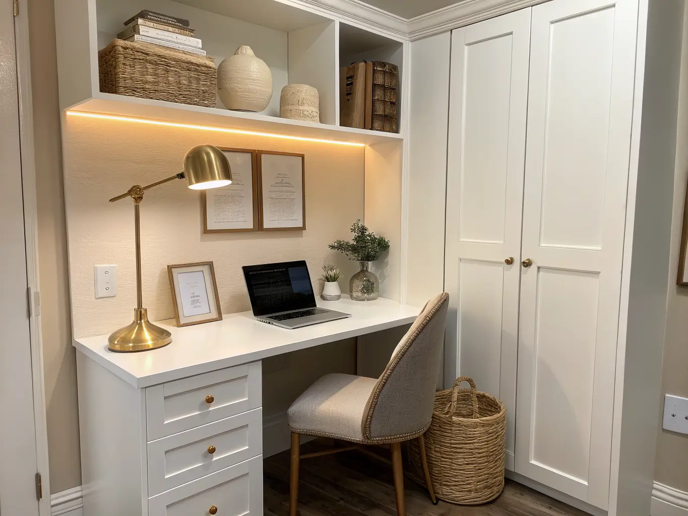
Instead, go for higher-LRV (light reflectance value) colors with some warmth or color in them — a pale greige, a soft warm gray, a barely-there sage. These bounce light around the room without the sterile flatness of true white. Benjamin Moore’s Ballet White or Sherwin-Williams Marshmallow do this well. They read as bright and clean but have just enough undertone to feel like a room someone actually lives in, not a rental unit mid-showing.
Rule of thumb: if a room gets less than a few hours of direct daylight, avoid anything with an LRV under 50. Save the deep navy and charcoal for rooms with real window light.
Should You Do an Accent Wall Behind Your Desk?
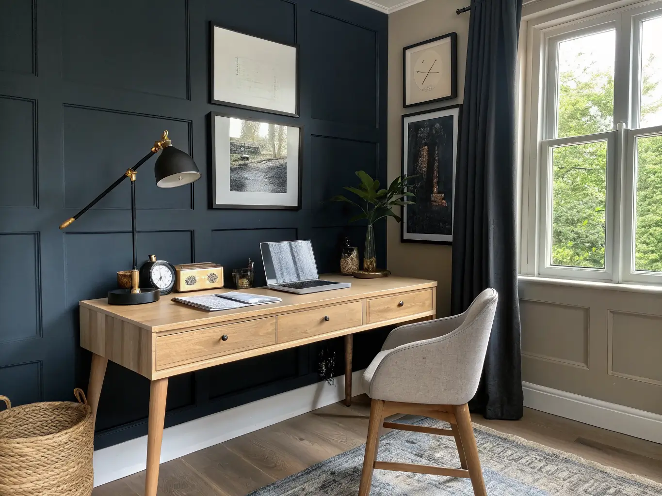
Yes, and here’s the practical reason beyond aesthetics: it’s the wall your camera sees all day. A deeper, more saturated color behind you on video calls reads as more intentional and put-together than a beige blur or, worse, a cluttered bookshelf.
Good camera-friendly accent choices:
– Medium blue-gray (Benjamin Moore Nimbus Gray)
– Deep sage or forest green
– Charcoal or deep navy, if your room has enough window light elsewhere to keep it from swallowing the space
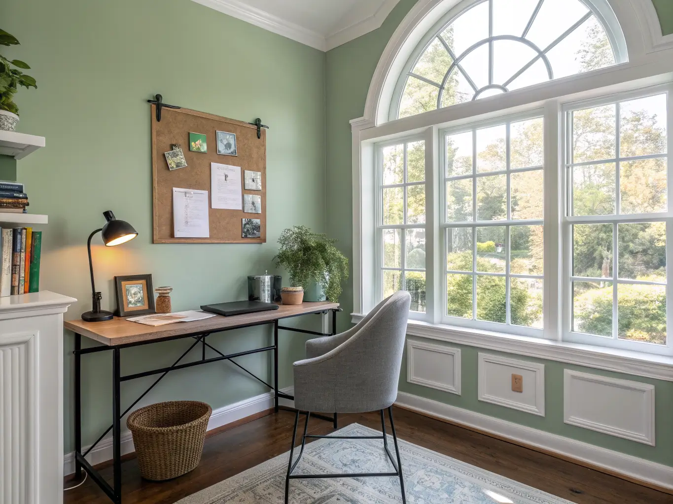
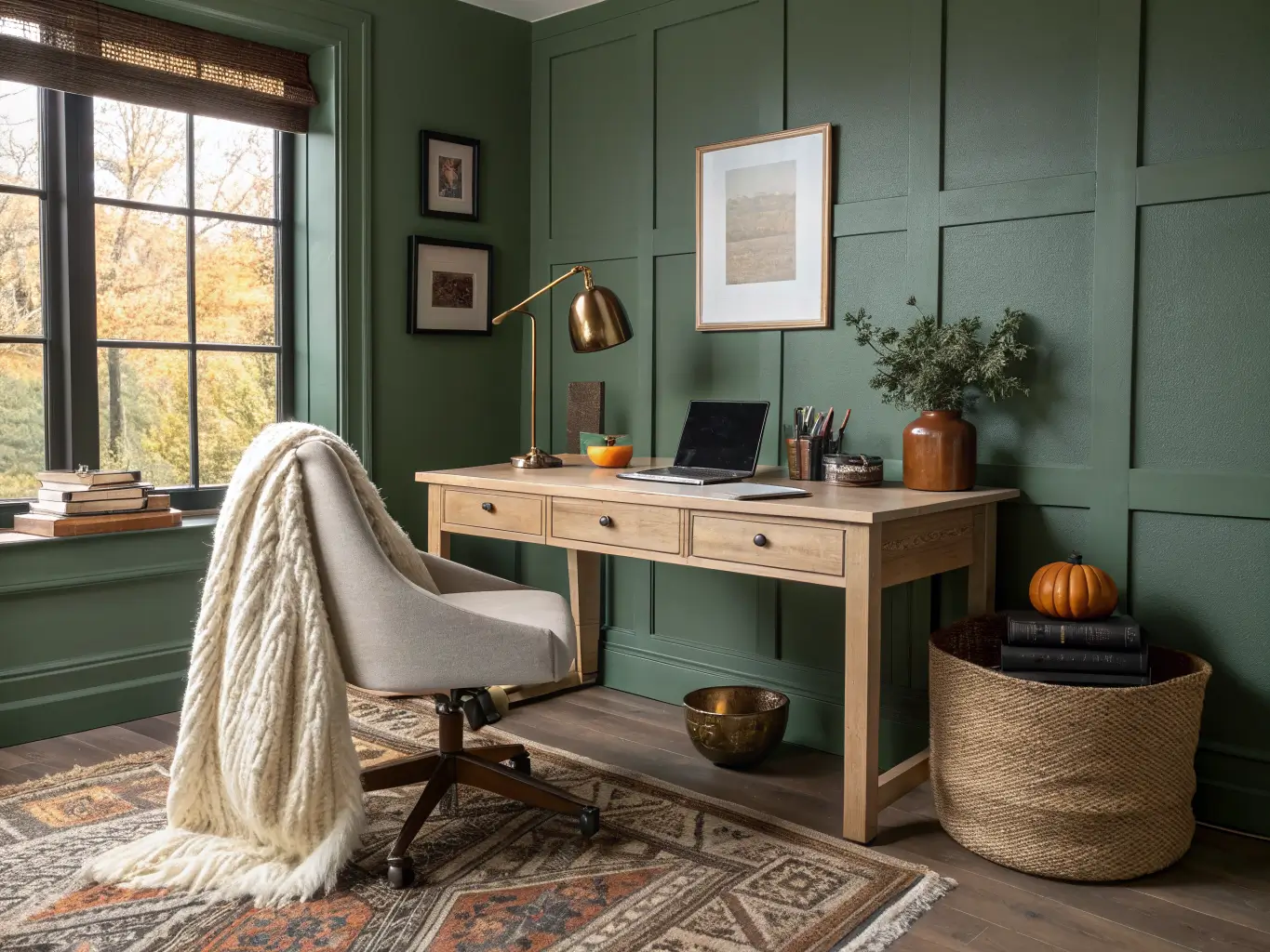
Keep the other three walls a lighter, complementary shade so the room itself doesn’t feel like a dark box when you’re not on camera. This is the approach I landed on with my own office — Pale Moss on three walls, a shade or two darker (Sherwin-Williams Dried Edamame) on the wall behind my desk. In photos and on calls it reads as deliberate. In person it just feels calm, not like I’m choosing between two different rooms.
Finish Matters More Than You’d Think
Matte or eggshell, almost always, for office walls. Flat/matte hides imperfections and doesn’t throw glare back at your monitor or camera. Higher sheens like satin or semi-gloss look sharper in photos but bounce light in ways that create weird hotspots on video calls and show every ding and scuff on a wall you’re staring at daily. Save higher sheen for trim and doors, where durability matters more than screen glare.
Pulling the Room Together
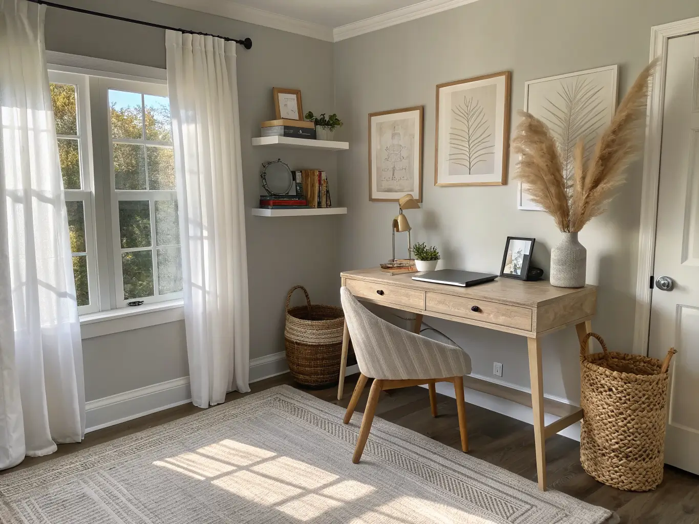
Paint color is maybe 40% of why an office looks and feels right. The rest is what you put in front of it.
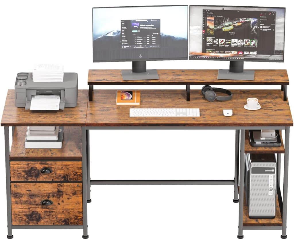
Desk: Natural wood, white laminate, or black metal all pair well with the palettes above. Dark walls look sharper with a lighter wood or white desk for contrast — I made the mistake early on of pairing my darker accent wall with a black desk, and the whole corner disappeared into itself. Swapped in a lighter oak desk and the wall finally had something to play off of.
Chair: Stick to gray, taupe, navy, or camel upholstery. These sit quietly against any of the wall colors above without competing.
Lighting: A black, brass, or white desk lamp — pick based on whether your other metals in the room are warm or cool. Don’t mix brass and matte black finishes in the same small room; it reads as indecisive rather than intentional.
Wall decor: One good piece. A framed print, a cork board, a single line drawing. Offices get visually loud fast because people try to make them feel personal with too many small objects. Pick one focal point for the wall your camera sees and leave it there.
Common Mistakes I’ve Made So You Don’t Have To
– Judging color from a 2×3 inch swatch card. I bought paint based on a chip held under store fluorescents once. Got it home, and it looked nothing like what I expected under my actual desk lamp. Sample pots exist for a reason — spend the $8.
– Going cold gray because it seemed “professional.” Icy gray with blue undertones can feel sterile and a little grim by the third gray day of winter. Warm grays (greige, taupe-gray) hold up better over time.
– Painting the whole room in a bold color because one wall of navy looked great in a magazine. An entire office in deep navy or forest green can feel like it’s closing in on you during a long workday. Use bold as an accent, not the whole environment.
– Forgetting how a color reads on camera. Very dark walls can look moody in person and murky on a laptop camera in low light. Very bright white can blow out and look harsh. Test it on an actual video call before committing.
– Choosing satin or semi-gloss for the whole room because it seemed more “finished.” It just shows every roller mark and creates glare where you don’t want it. Matte or eggshell, every time, for the walls.
Keeping It From Feeling Like a Random Assortment of Nice Things
Limit yourself to a tight palette: your wall color, a trim color, your desk/wood tone, and one metal finish. That’s it. Four elements. Every additional color or finish you introduce is one more thing that can clash.
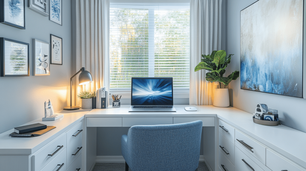
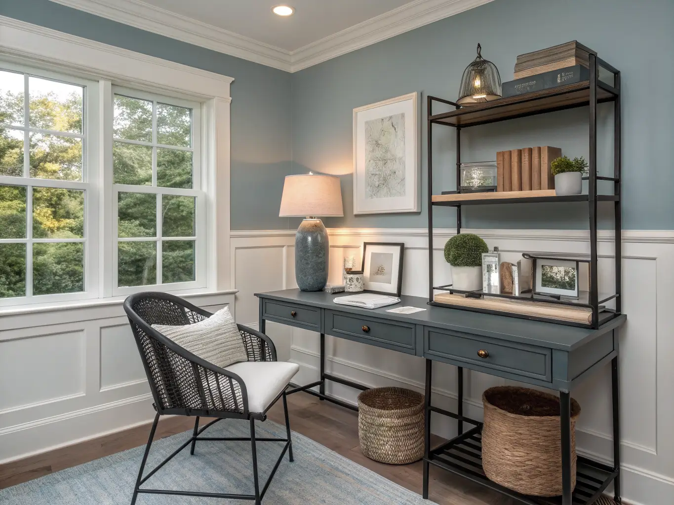
Repeat undertones throughout the room. If your wall is warm (sage, warm gray, greige), stick with warm wood tones and brass or bronze hardware. If your wall is cool (blue, blue-gray, cool gray), pair it with black metal, white, or ash-finish wood. Mixing warm and cool without intention is the single most common reason a room feels “off” without anyone being able to say why.
Keep storage closed or uniform. Open shelving stuffed with mismatched binders and cables undercuts even the best paint job. A few closed baskets or matching bins do more for the room’s cohesion than another accent color would.
Updating It Without Repainting
You don’t need to repaint every season to keep the room feeling current. Swap the smaller stuff instead:
– Spring/summer: lighter ceramics, a small potted plant, linen curtains instead of heavier drapery
– Fall/winter: add a wool throw on your office chair, swap in a brass-based lamp, bring in a deeper-toned rug
If you want a completely different feel without a new paint job, change the framework around the color instead:
– Boho office: sage or clay-toned walls, rattan storage, linen textures, a jute rug
– Modern coastal: blue-gray walls, white trim, woven baskets, lighter wood
– Traditional update: deep green or navy walls, brass hardware, dark wood desk, leather chair
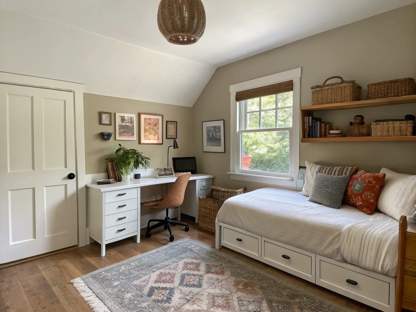
If the room does double duty — office and guest room, office and craft space — keep the base neutral and let a single accent wall or a rotating cast of accessories carry the personality. That’s the version that ages best, because you’re not locked into “productivity zone” forever if the room’s job changes.
The paint color is the decision that’s hardest to undo, so it’s the one worth testing properly before you commit. Everything else in the room you can swap on a weekend.
For another angle on this, my home office ideas guide covers the same space from a different starting point.