I spent two years thinking my study just needed “more stuff” before I figured out the opposite was true. Luxury study room design isn’t about filling shelves — it’s about editing hard, layering materials with intention, and letting two or three excellent pieces do all the talking. I learned this the expensive way, after buying a heavily carved wooden desk that I thought screamed “executive” and instead just screamed “too much.” It went to my cousin’s place within a year. What replaced it — a slab of honed marble-look quartz on a simple brass frame — is still there five years later.
If you’re trying to figure out how to make a study room look genuinely high-end rather than just “matching,” here’s everything I’ve learned building and rebuilding mine.
What “Luxury Study Room” Actually Means (And Who It’s For)
A luxury study isn’t defined by price tag alone. It’s defined by restraint. The look I keep coming back to — and the one showing up everywhere in current design references — is modern luxe: clean lines, a tight color palette, high-quality materials, and almost nothing decorative that doesn’t serve a purpose. The old-school wood-paneled library look still has fans, and it works beautifully if you commit to it fully, but it’s a heavier, more traditional commitment.
This style suits:
– Professionals and executives who take calls from home and need the background to look put-together
– Students or serious readers who want a space that feels different from the rest of the house
– Anyone tired of a home office that looks like a leftover corner with a desk shoved into it
It works best in a dedicated room of 50–100 sq. ft., but I’ve also built a convincing version into a 7×8 ft nook using a wall-mounted desk and floating shelves — more on that later. Any of these settings work: a spare bedroom converted to a study, a home office, a library corner off the living room, or a work nook inside a primary suite.
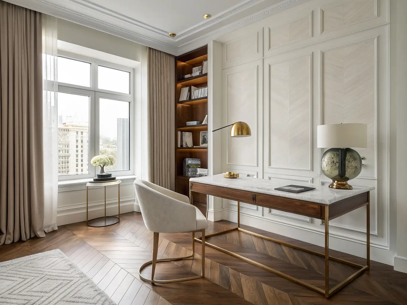
How Much a Luxury Study Room Actually Costs
This is the question I get asked the most, and the honest answer is: it scales hard depending on how custom you go.
– ₹3–5 lakhs — a basic luxury-leaning setup: quality desk, good chair, layered lighting, a rug, no structural millwork
– ₹5–8 lakhs — a mid-range custom study with built-in shelving, better finishes, some stone or veneer detailing
– ₹8–10 lakhs and up — full bespoke work: custom cabinetry, natural stone, dedicated lighting circuits, original art (excluding GST)
The line items that actually drive cost up are custom cabinetry, premium stone surfaces, wiring for layered lighting, and original art. Everything else — rugs, lamps, accent chairs — is negotiable and swappable. My advice: don’t cheap out on the desk or the storage carpentry, because those are permanent. Do cheap out on the decorative tray and the coffee-table book stack. Nobody’s judging your throw pillows for cost-per-unit.
Timeline-wise, a styling refresh with furniture you already own takes 1–3 days. A full custom build with millwork and electrical work realistically takes 2–6 weeks, mostly waiting on carpentry and stone fabrication.
The Core Palette and Materials That Read Expensive
Color does more work here than people expect. The palette that consistently looks luxurious rather than trendy:
– Ivory, champagne, and charcoal — a soft neutral trio that ages well
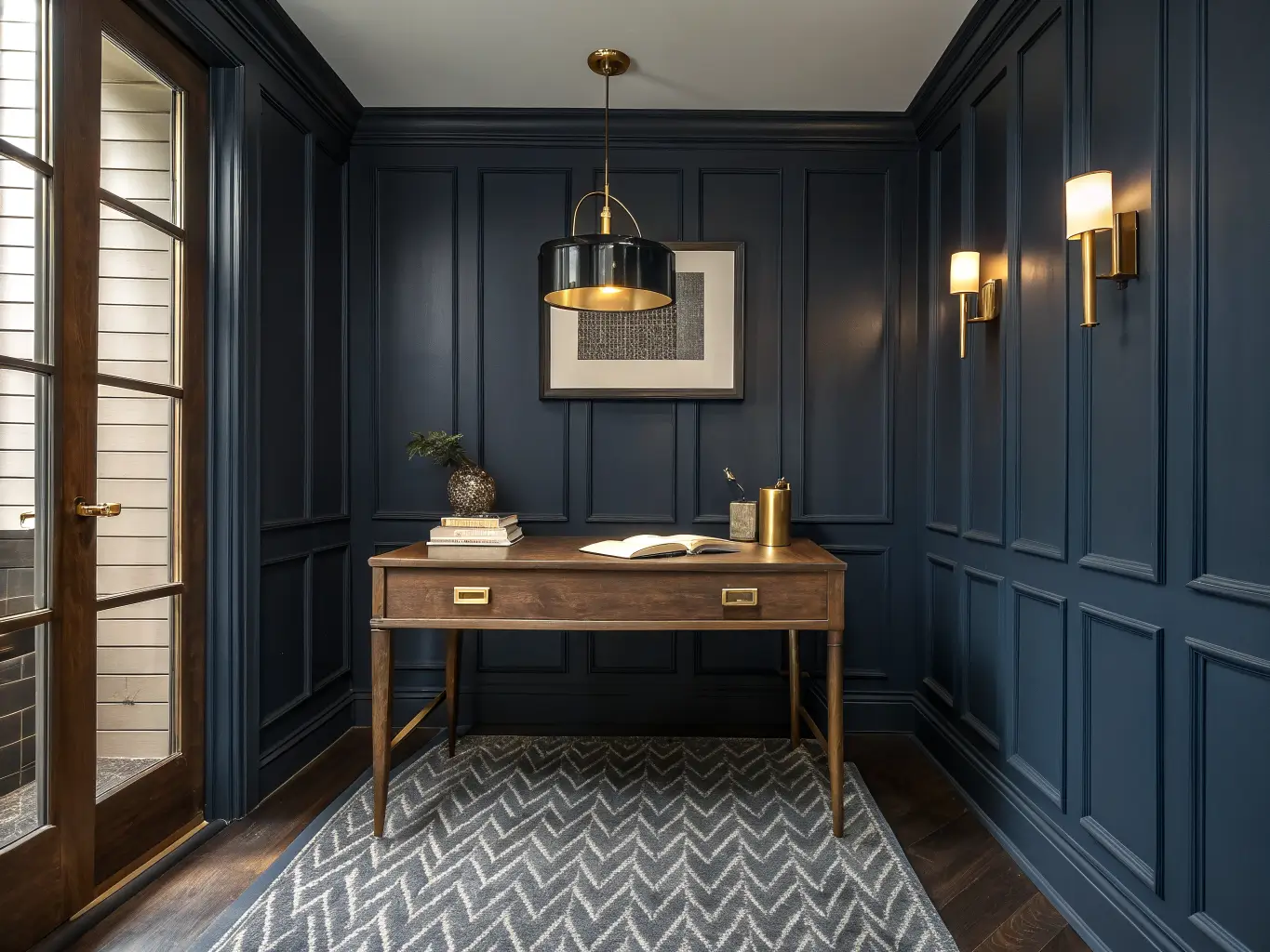
– Deep navy with brass or gold accents — dramatic, works especially well in a smaller room where you want one bold wall
– Warm grey, sage, or brown with natural wood tones for something calmer and more organic
Pick one story and stay inside it. My study is ivory walls, walnut wood tones, and brushed brass hardware — nothing else. That restraint is what makes it look considered instead of accidental.
On materials, the ones that actually elevate a room:
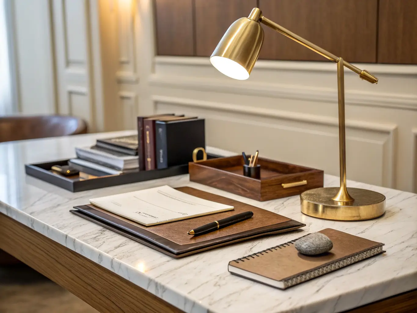
– Marble or marble-look engineered stone for desktops or side tables
– Polished brass or gold-toned metal for hardware, lamp bases, and pulls
– Leather on the chair seat or a document tray
– Fluted panels as a wall treatment behind the desk
– High-gloss lacquer or laminate on cabinetry fronts
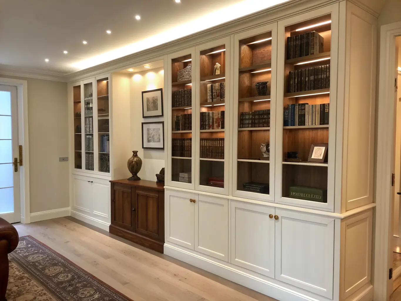
– Tempered glass for shelving or cabinet doors, so storage doesn’t feel heavy
The trick is mixing textures without mixing metals or wood tones. One metal finish. One or two wood tones, max. I broke this rule early on — chrome lamp, brass drawer pulls, gold picture frame — and the room looked like a hardware store display until I unified everything to brushed brass.
The Must-Have Pieces (In Order of Priority)
1. The desk — your focal point, non-negotiable
This is where I’d spend the most. A desk in wood veneer, lacquer, or a marble-look stone top on a metal frame anchors everything else in the room. Get the scale right: for a 50 sq ft room, a desk around 4.5–5 ft wide is plenty. Bigger swallows the room.
2. An ergonomic chair that doesn’t look like an ergonomic chair
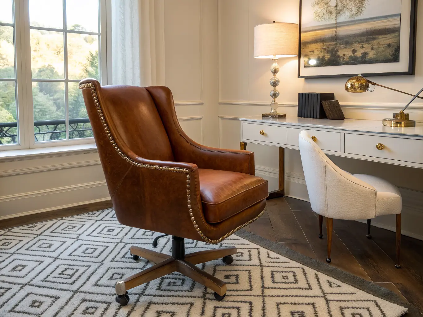
Leather or performance velvet upholstery on a chair with actual lumbar support. This was my second mistake after the carved desk — I bought a gorgeous cane-back chair that looked incredible in photos and destroyed my back after 40 minutes. Beauty without function isn’t luxury, it’s a prop.
3. Built-in or modular shelving
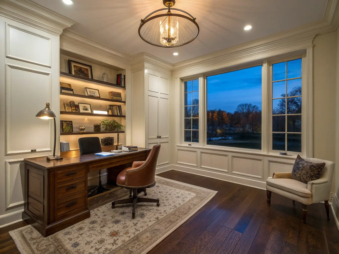
Floor-to-ceiling shelving, mixing open display with concealed cabinet storage, is the single biggest luxury cue in every reference image you’ll find. It also solves clutter, which is the enemy of this whole look.
4. Layered lighting — task, ambient, and accent
One overhead light is not enough. You need:
– A task lamp on the desk (adjustable arm, warm-toned shade)
– Ambient overhead lighting, ideally on a dimmer
– Accent LEDs inside or under shelving
Stick to warm-white light in the 3000K–4000K range. Anything cooler makes a study feel clinical instead of calm — I made this mistake with 6000K LED strips under my shelves and it looked like a hospital corridor until I swapped the bulbs.
5. A quality area rug
Wool or a silk-wool blend, ideally something with a subtle pattern rather than a bold one. This is what makes a hard-floored study feel finished and warm underfoot.
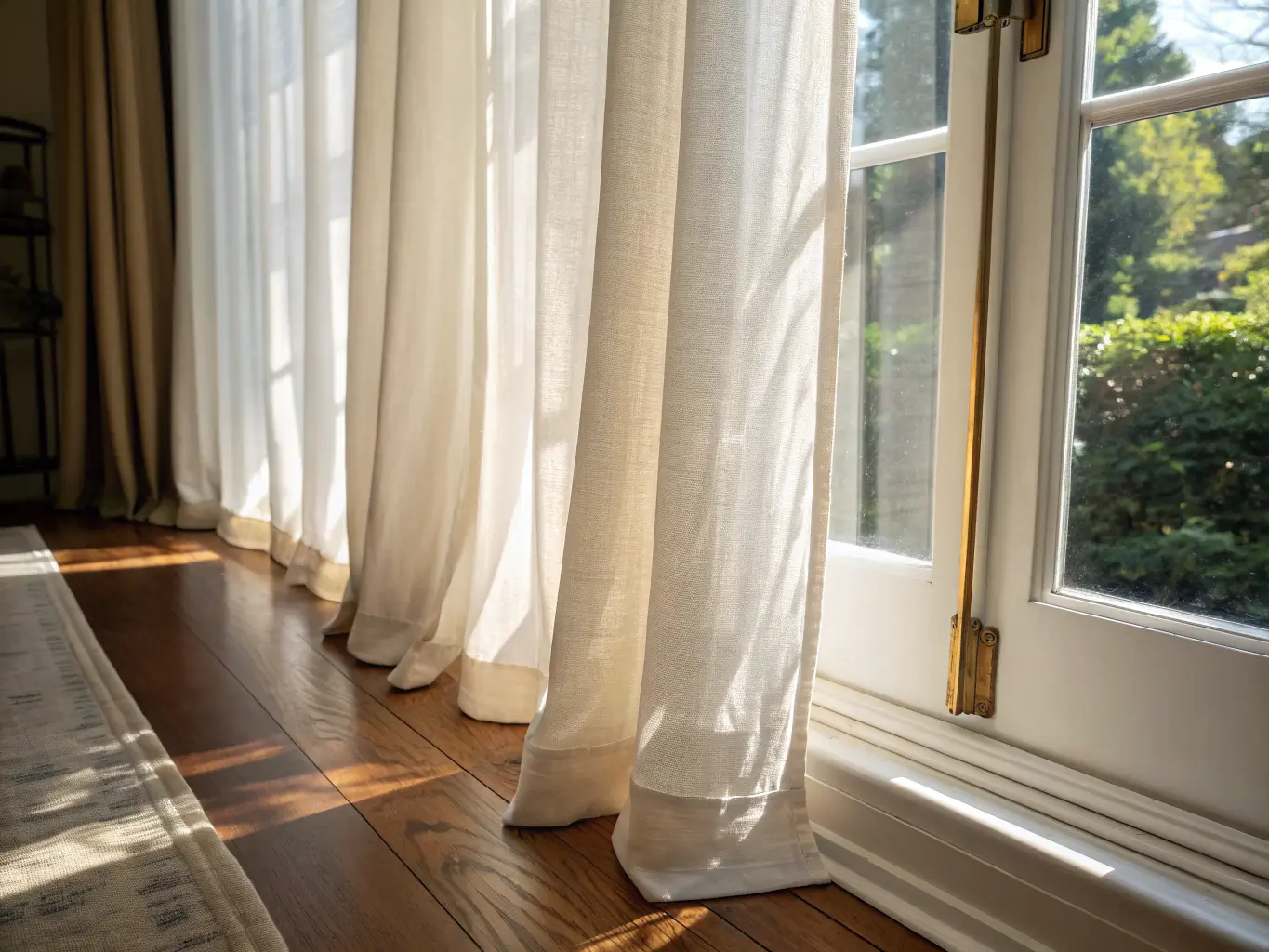
6. Window treatments
Curtains or blinds that control glare on your screen and finish the room visually. Don’t skip this — bare windows undercut every other luxe element in the space.
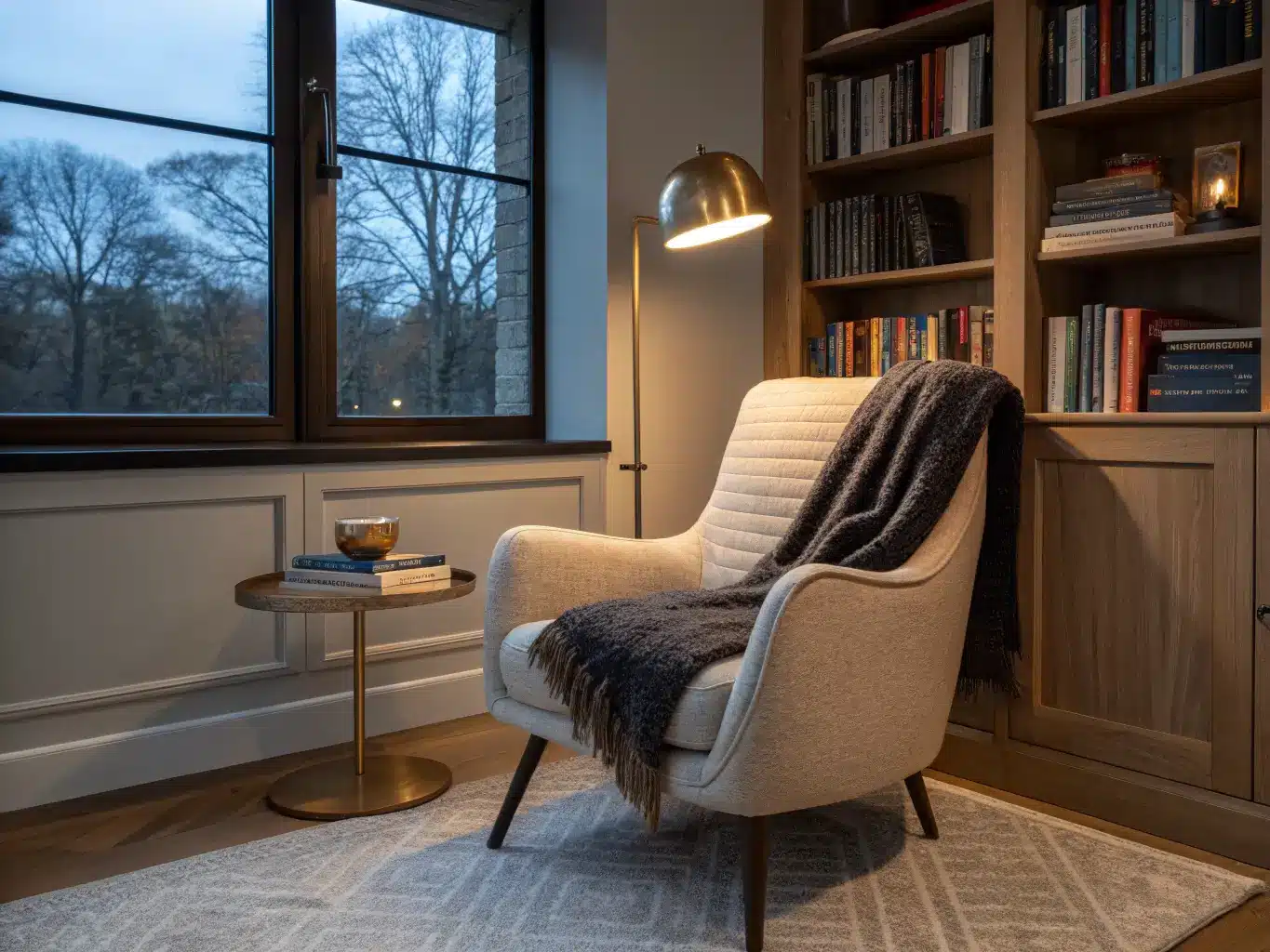
7. A reading or accent chair
One armchair near the shelving turns a study into something closer to a private library. It also gives the room a second function beyond desk work.
Optional Details Worth Adding
Once the core pieces are in place, these are the additions that push a study from “nice” to genuinely high-end:
– An accent wall behind the desk — fluted paneling, dark wood laminate, or a subtle geometric wallpaper
– Metallic details in hardware, lamp bases, or a small tray — brass, polished nickel, or a bit of crystal in a light fixture
– One large piece of art or a sculptural object, rather than five small ones. Current luxury studies favor a single statement over a gallery wall.
– Soft acoustic elements — the rug, upholstered chair, and any fabric panels quietly improve how the room sounds, which matters more than people realize on video calls
– Hidden tech infrastructure — extra plug points, cable management channels, even a CAT 6 data point if you’re doing custom electrical work. Boring to plan, invaluable once you’re living with it.
Putting It Together: Order of Operations
I’ve rearranged my study three separate times, and the version that finally worked came from doing things in this order:
1. Define the function first. Reading room? Hybrid office? Executive space for client calls? This decides desk size, seating count, and storage needs before you buy anything.
2. Place the desk for light, not for looks. Natural light from the side (not directly behind or in front of your screen) is ideal. I originally put my desk facing a blank wall for “focus” and ended up feeling boxed in within a week. Facing it toward the window, angled slightly into the room, fixed both the light and the claustrophobia.
3. Plan storage and wiring before you style anything. If you’re doing built-ins, get the carpentry and electrical settled first. Trying to retrofit lighting circuits after the shelves are up is how projects balloon in cost.
4. Bring in the anchors: desk, chair, shelving, rug.
5. Layer lighting.
6. Add soft furnishings — curtains, the accent chair, any additional textiles.
7. Finish with edited accessories — a stack of books, one tray, one sculptural object, one artwork, a single plant. Stop there. This is the step people overdo.
Mistakes That Quietly Kill the Luxury Look
– Over-decorating. This is the single biggest issue I see and the one I was guilty of first. More objects doesn’t mean more luxury — it means more visual noise.
– Prioritizing looks over ergonomics. A chair or desk height that hurts to use daily isn’t a luxury item, no matter what it cost.
– Relying on one overhead light. Flat lighting flattens the whole room’s mood. Layer it.
– Skipping storage planning. Papers and cables in view undo everything else, instantly.
– Getting the scale wrong. Oversized furniture crowds a small room; undersized furniture makes a large room feel empty and unfinished. Measure before you buy, every time.
Keeping It Fresh Without Redoing the Whole Room
Once the bones are right, you don’t need to touch them again for years. What I actually change:
– Seasonally: throw or cushion covers, fresh flowers or a different plant, a new stack of books, swapping out desk accessories
– On a budget: new drawer pulls, a better desk lamp, a slightly larger rug, a fresh coat of paint on just the accent wall, concealed LED strips added to existing shelving
For anyone wanting to shift the mood without starting over, a few combinations work well as a refresh rather than a renovation:
– Modern luxe + library — add closed glass-front cabinets to an existing open shelf wall
– Minimalist + brass accents — strip back decor, add warm metal hardware
– Dark academia + polished finishes — deepen the wall color, keep the metals sleek instead of antiqued
Keep your finishes consistent across any update — one wood tone, one metal, one textile family — and the room will always read as intentional, even years and several small refreshes later. That consistency is really the whole secret to this style holding up over time: it was never about how much you spent, it’s about how disciplined you were with what you chose.
For another angle on this, my study room decor guide covers the same space from a different starting point.